
As a SaaS owner, you understand the significance of making a remarkable first impression on your users. And that initial encounter they have with your app happens through the onboarding screens.
These screens hold the potential to ignite user engagement or leave them feeling frustrated and bewildered.
Needless to say, the latter is the last thing any SaaS owner desires. So, how can you guarantee that your onboarding screens captivate and inspire users? In this blog, we will explore 13 captivating examples that SaaS owners can adopt to ensure their onboarding process is not only informative but also engaging and wildly successful.
What is Onboarding Screens?
Onboarding screens are an important part of any digital product’s user interface, specifically designed to facilitate user understanding and navigation of a new application. They serve as the user’s first guide, introducing them to the key features, functionalities, and benefits of the app.
These screens play a pivotal role in shaping the user’s initial experience and perception of the product, making it crucial for them to be clear, intuitive, and engaging. Properly designed onboarding screens can effectively increase user engagement and retention, ultimately contributing to the overall success of the application.
Types of Onboarding screens
There are various types of onboarding screens that SaaS owners can use to introduce their app to users. These include:
• Onboarding screens vary in form and function, including signup forms, welcome pages, and empty states.
• Signup forms collect data and showcase products.
• Welcome pages provide an opportunity to introduce users to your product warmly, setting expectations and segmenting users.
• Empty states provide helpful information that drives user success.
Onboarding flows VS Onboarding screens
Both onboarding screens and flows are important for introducing new users to a product or feature.
Screens are used for mobile apps, where users provide information to get started. Flows can appear as tooltips and guided tours for more complex SaaS. Screens can be a one-off or part of a larger process, while flows span a user’s lifecycle.
Both teach users how to interact with the interface and complete setup. Flows also answer questions like how to start using the app, its benefits, and how it solves user problems. Screens teach users how to fix errors, while flows can be monitored to find and fix bottlenecks.
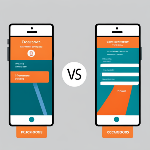
Here is a comparison table for onboarding screens vs onboarding flows:
| Onboarding Screens | Onboarding Flows |
|---|---|
| A series of screens that introduce new users to a user interface or new feature | A comprehensive and user-friendly framework designed to assist users in seamlessly onboarding with a new SaaS product. |
| Typically used for mobile apps, where users need to provide information to get started | To enhance user experience in complex SaaS products, tooltips and guided tours can be implemented, providing helpful hints and step-by-step instructions within the application. |
| Can be useful when users need to create an account and confirm their identity before using the app | Can contain feature promotion, customization, and instructions |
| For a clean design, use ample white space, concise and easy-to-follow language, and motivating imagery and colors. | Combine steps to convey the right message at the right time. |
| Can be a one-off experience or part of a larger onboarding process | A continuous process spanning a user’s lifecycle |
| Can be used to teach users how to interact with the interface and complete any necessary setup | Can answer questions like how to start using the app, how the app works, what are the benefits of the app, how the app solves the user’s problem, and what data is needed to use the app |
| Can be used to teach users how to fix errors in a “teachable moment” | Can be monitored using session, user, and funnel analysis to find and fix bottlenecks and understand what actions get users where |
13 Onboarding Screens Examples
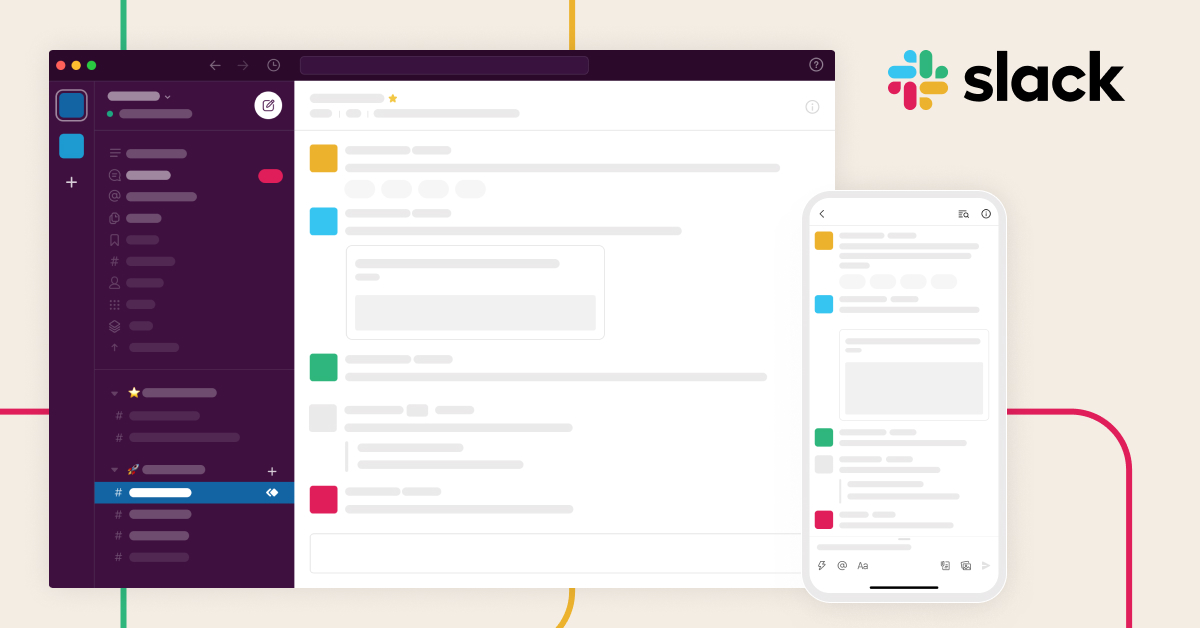
Slack: A minimum viable onboarding

Slack onboarding screens show only the pertinent information necessary for new users to get started. By minimizing the amount of content, users can breeze through the onboarding process quickly, allowing them to start using the app without any hassle.
Headspace: Interactive and fun onboarding
Headspace onboarding process includes an animated sequence of a character meditating and a voice-over guiding the user through the process. This makes the onboarding process more interactive, and the character creates an emotional connection with users, making the process more fun and memorable.
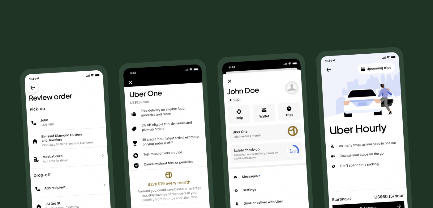
Uber: Personalized onboarding

Uber onboarding screens ask users for their personal information, such as name and location, before asking them to request a ride. This personalized approach ensures users are invested in the onboarding process and therefore more likely to continue using the app.
Dropbox: Clear and concise
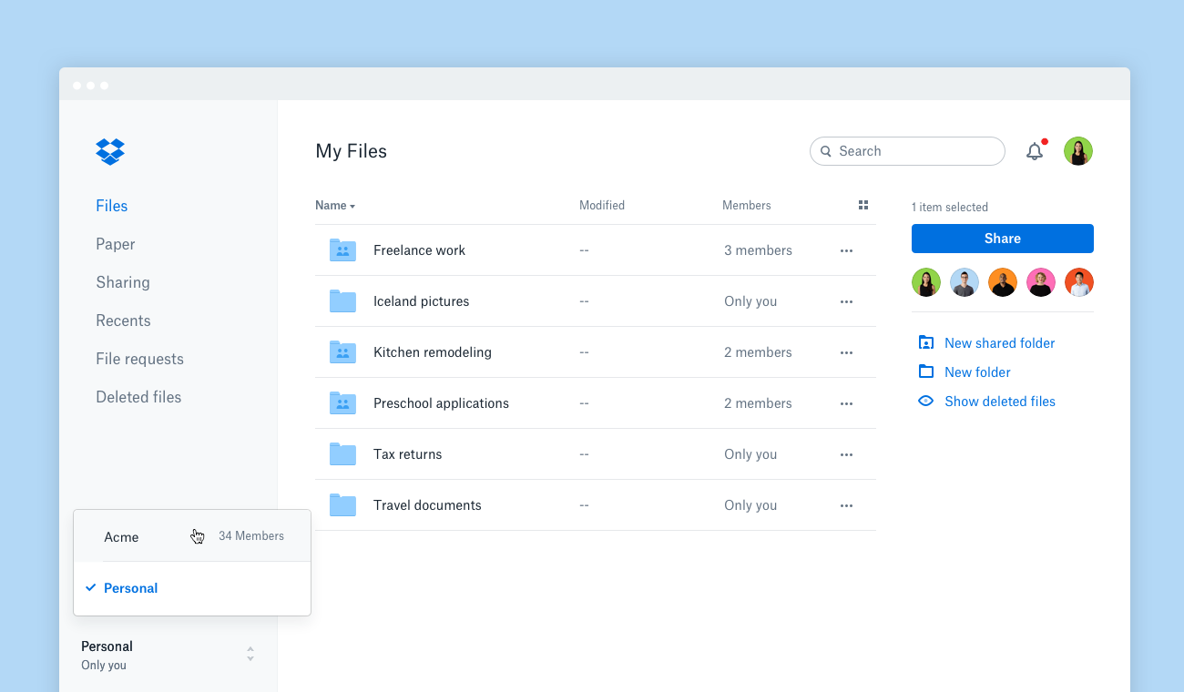
Dropbox onboarding screens are simple and easy to follow, using minimalist designs and concise copy. This approach minimizes distractions and ensures users understand and retain the information presented to them.
Duolingo: Gamification onboarding
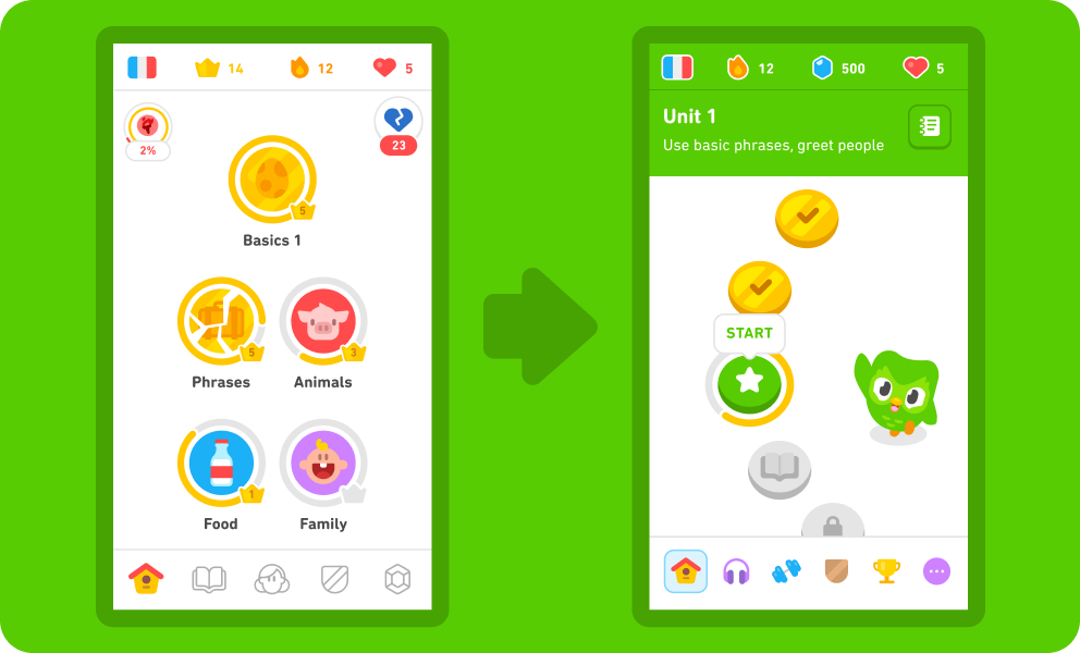
Duolingo’s onboarding process includes gamification, using points and rankings to incentivize users to continue using it. Its onboarding approach not only makes the onboarding process more engaging but also encourages users to continue using the app long after onboarding is complete.
Waze: Interactive and informative
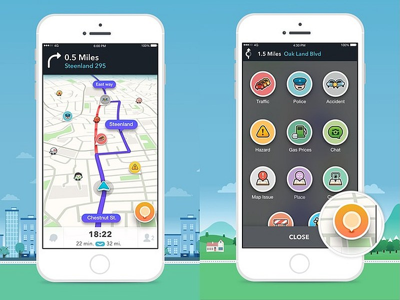
Waze uses a combination of interactive animations and informative copy to guide users through their onboarding process. Its onboarding dual approach breaks up monotony and keeps users engaged, while also providing useful information and guidance.
Evernote: Guided tours
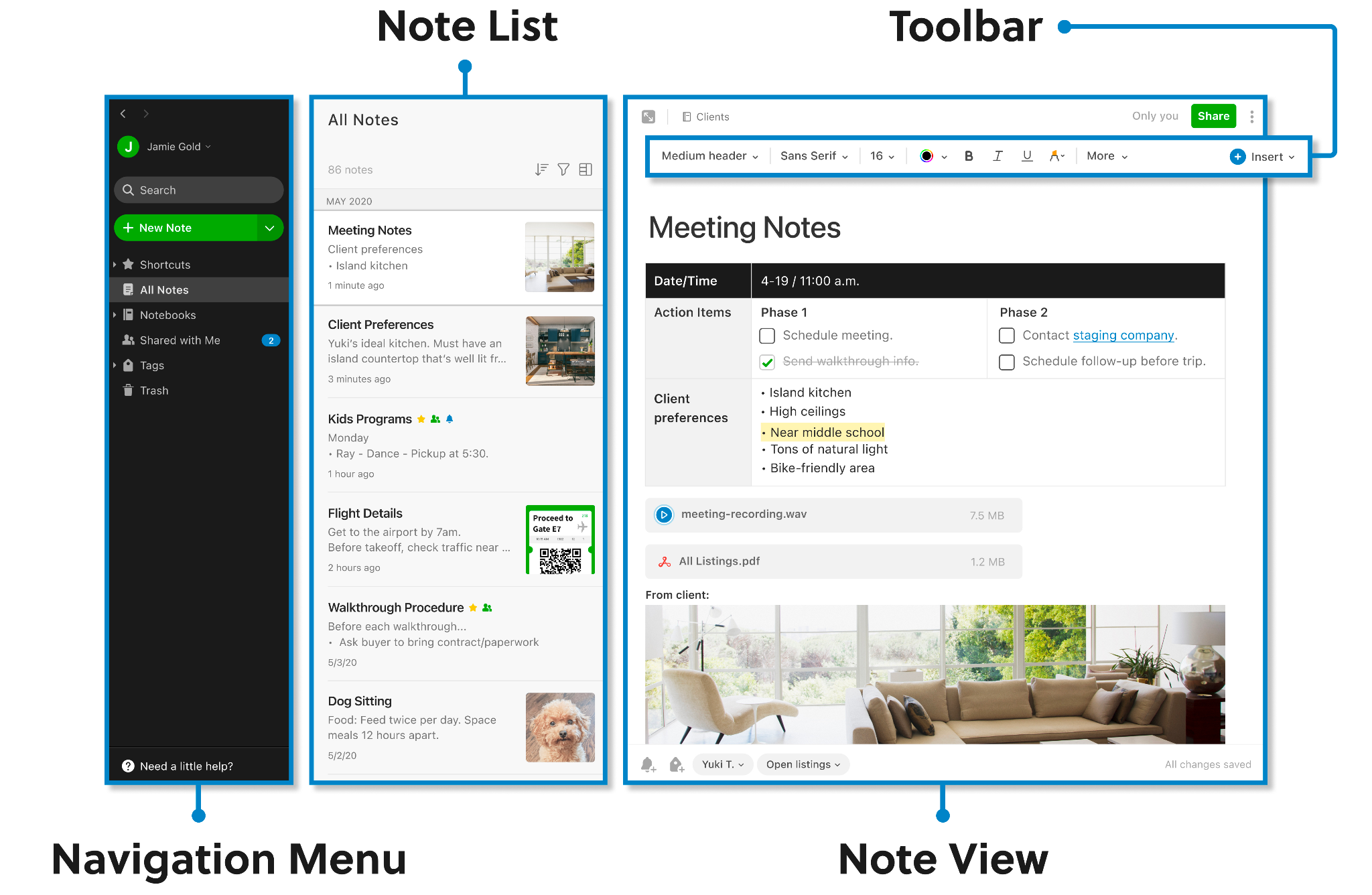
Its onboarding process isn’t too different from the others, but they provide users the option to receive guided tours of the app. This ensures the user has a comprehensive understanding of the product, reducing the likelihood of them becoming frustrated and giving up.
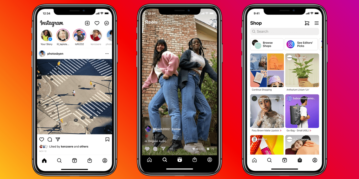
Instagram: Creative visuals

Instagram uses a visual onboarding process that showcases the app’s main features and benefits with fun illustrations and creative copy. Its onboarding approach makes the onboarding experience more memorable and encourages users to start using the app immediately.
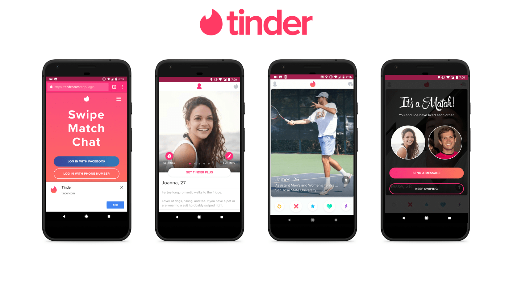
Tinder: Clear and concise onboarding process

Tinder has one of the simplest onboarding processes, using clear and concise copy and animations to guide users through the process. Its onboarding simplicity makes it easy for users to understand the process, ensuring that they are quickly able to start using the app.
Mint: Personalized approach
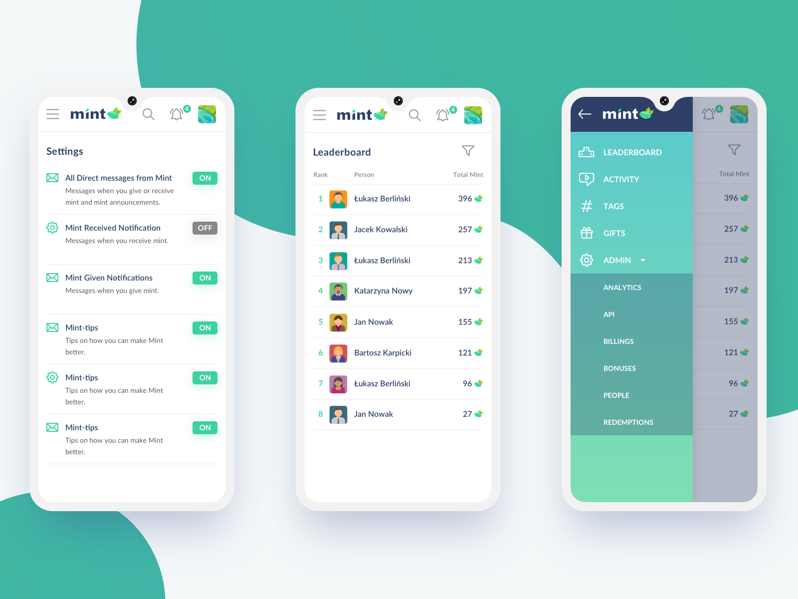
Mint’s onboarding screens ask users specific questions about their financial situations, then use that information to provide personalized financial advice. Its onboarding personalized approach makes users feel like the app is tailored to their needs, making them more likely to continue using it.
Doodle: Easability

Doodle’s onboarding screens use a minimalist design with clear and informative copy that presents information in an easily digestible format. Additionally, its onboarding screen only shows a few options at a time to prevent users from being overwhelmed and to in turn help them enjoy the experience.
LinkedIn: Long-form onboarding
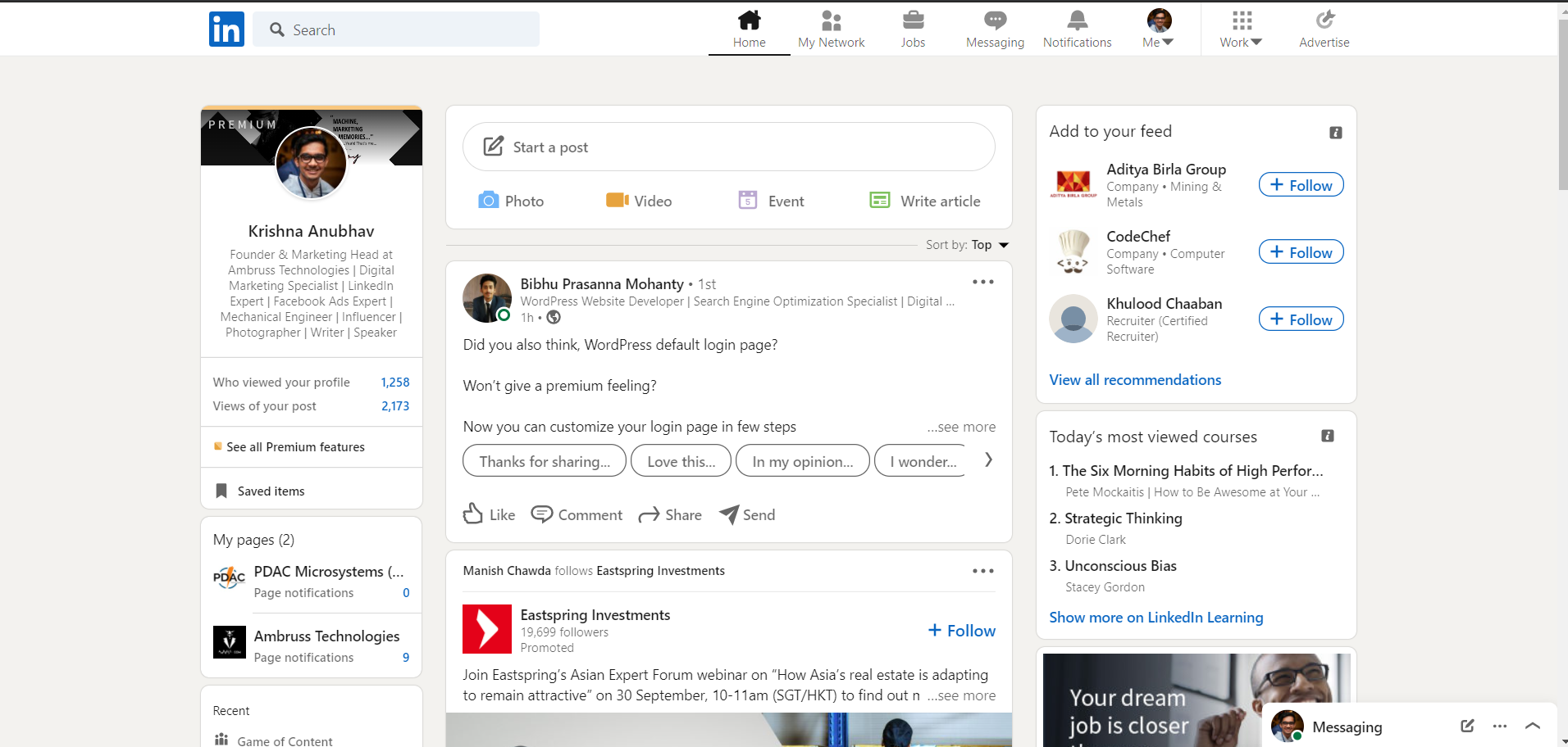
LinkedIn’s onboarding process includes a long-form questionnaire to better understand the user’s skills and job history. Even though its onboarding approach takes more time, it allows LinkedIn to suggest relevant groups and connections that may benefit the user long-term.
Venmo: Simple, yet effective

Venmo’s onboarding screens use playful copy and colorful graphics that make the onboarding process simple yet effective. Its onboarding approach takes the mundane aspect of adding payment information into a more interesting and enjoyable process.
FAQs
How do I create a great onboarding experience?
Creating a phenomenal onboarding experience doesn’t have to be complex. First off, you gotta put yourself in the shoes of the user and consider their needs and expectations. A clear and concise introduction of what your app does is essential. Also, remember to keep it simple; don’t overwhelm users with too much information all at once.
Show them the ropes through step-by-step guidance or tutorials. Personalization also plays a key role; if users feel the app is tailored to their requirements, they’re more likely to stick around. Utilize engaging graphics and interactive elements to keep the process fun and interesting.
Lastly, always seek and welcome feedback from your users – it’s an invaluable resource for continuous improvement.
What are the key elements of an effective onboarding screen?
The key elements of an effective onboarding screen include clarity, brevity, and engagement. Clarity is pivotal – users need to understand your app’s main features and how to use them. Keep the language simple and instructions straightforward. Brevity is equally important; onboarding shouldn’t feel like a chore.
Therefore, avoid lengthy explanations and keep content concise. Engagement can be achieved through the use of vibrant visuals, interactive tutorials, and personalization. An onboarding experience that entertains and resonates with users can leave a lasting impression, encouraging continued use of the app.
Remember, the goal of onboarding is to demonstrate the value of your app to the users quickly, so they understand why they should continue using it.
How can I engage users in the onboarding process?
Engaging users in the onboarding process involves a blend of strategy, creativity, and user-centric design. Here are a few ways you can achieve this:
- Personalization: Tailoring the onboarding experience to individual user needs can significantly boost engagement. For instance, Spotify suggests music genres during onboarding, curating a personalized playlist for each new user.
- Gamification: Incorporating game elements can make the onboarding process fun and interactive. Duolingo, for example, uses streaks, points, and badges to motivate users to continue learning.
- Progress Indicators: Showing users their onboarding progress encourages them to complete the process. LinkedIn displays a progress bar, prompting users to fully complete their profiles.
- Interactive Tutorials: Hands-on tutorials engage users better than static instructions. Headspace, a meditation app, offers a short interactive session to first-time users, giving them a taste of what to expect from the app.
- Minimalistic Design: A clean, uncluttered onboarding experience can prevent users from feeling overwhelmed. Instagram’s onboarding process, for example, is straightforward and to-the-point, focusing on core features.
Keep in mind, the key is to demonstrate the value your app offers while making the onboarding process as enjoyable and intuitive as possible.
What are some examples of successful onboarding screens?
- Airbnb: Airbnb presents a clean and welcoming onboarding screen, guiding users through the process with interactive maps and location preferences. This personalized approach immediately showcases the app’s usefulness and functionality.
- Evernote: Evernote simplifies onboarding by using dynamic illustrations and minimal copy to walk users through its core features. The screen design is visually appealing and easy to comprehend, enhancing user engagement.
- Slack: Slack takes a conversational approach to onboarding. New users are welcomed by Slackbot, the app’s AI, which guides them through the platform and answers potential questions. This friendly, human-like interaction sets the tone for the app’s communication-focused feature set.
- Pinterest: Pinterest uses a quick questionnaire to understand user preferences, which it then uses to curate a personalized home feed. This approach immediately shows users the value of the platform, improving user retention.
- Uber: Uber’s onboarding process is quick and focused, emphasizing the app’s primary function – booking a ride. The app instantly shows a map with available rides, making it clear how easy the app is to use.
What considerations should I make when designing an onboarding screen?
- Simplicity: Keep the process straightforward and intuitive. For instance, Facebook’s onboarding process is a good example. They guide you step by step, not overwhelming the user with too many features at once.
- Purposeful Guidance: Each onboarding step should be meaningful and educate the user about the app’s unique features. Instagram, for example, directly takes users to create their first post after signing up, emphasizing its core feature.
- Interactive Elements: Having interactive components can keep users engaged. Duolingo, for instance, initiates users by having them complete a lesson in their target language.
- Personalization: Tailoring the onboarding process based on user preferences or behavior can lead to better engagement. Spotify, for example, asks new users about their music preferences to curate personalized playlists.
- Visual Aid: Using visual elements to guide users can make the process more enjoyable. Headspace uses animations to make their onboarding process entertaining and inviting.
- Clear Call to Action: Each onboarding screen should guide the users towards a specific action. LinkedIn prompts users to complete their profiles, guiding them to their next step.
- Contextual Help: Offering help or tips in context can reassure users and improve their experience. Google Maps, for instance, provides tips on how to navigate the map, place pins, and use other map tools during the onboarding process.
Conclusion
As we’ve witnessed through these examples, there is no “one size fits all” approach to onboarding screens. However, they do share some common ideas: the use of playful visuals and captivating copy, combined with concise and personalized steps.
By implementing simple design tweaks and engaging methods, onboarding screens can significantly enhance app engagement and user-friendliness. So, don’t hesitate to shake up your onboarding process and give these examples a try to discover what works best for you!